collectionHQ cHQselect design system
The design system that cut screen design from four days to one
cHQselect's beta ran on the old product's components. I rebuilt every one from scratch, and it's what every screen is made from now.
- Role
- Senior UX Designer
- Timeline
- 2026 to now
- What I owned
- Colour and type tokens, Component library, Accessibility, Developer hand-off
- Status
- Shipped
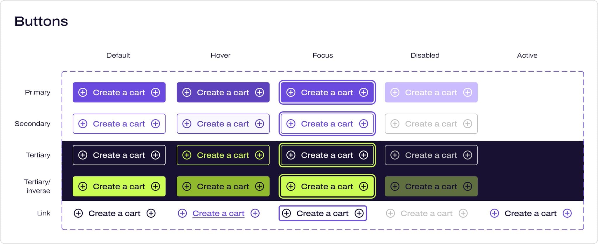 1Five types, 21 variants2Every one has its own focus state3Tertiary buttons sit on Midnight Sky
- 1Five types, 21 variants
- 2Every one has its own focus state
- 3Tertiary buttons sit on Midnight Sky
The problem
We'd built the cHQselect beta out of the old product's components, and they were dated, inaccessible and missing things we needed. We couldn't launch a new product on them.
- My role
- I created the whole system in Figma: the colour and type tokens, every component and its variants, the icons, and the hand-off to the developers.
- The team
- Seda, the UI designer I manage, designs from it every day, and our developers build from it.
The result
How this was measured
This is rough guidance and not a stopwatch. Designing the UI for a screen used to take about four days, and with the library it takes about one.
My own estimate
How this was measured
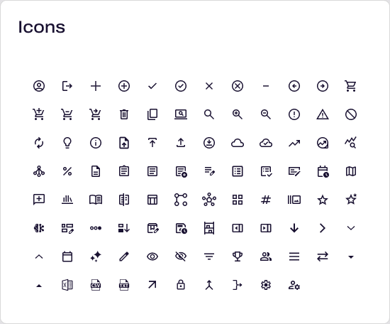
I counted these in the Figma file. There are 37 component sets holding 203 variants between them, three single components and 94 icons.
The cHQselect design file, 18 September 2026
How this was measured
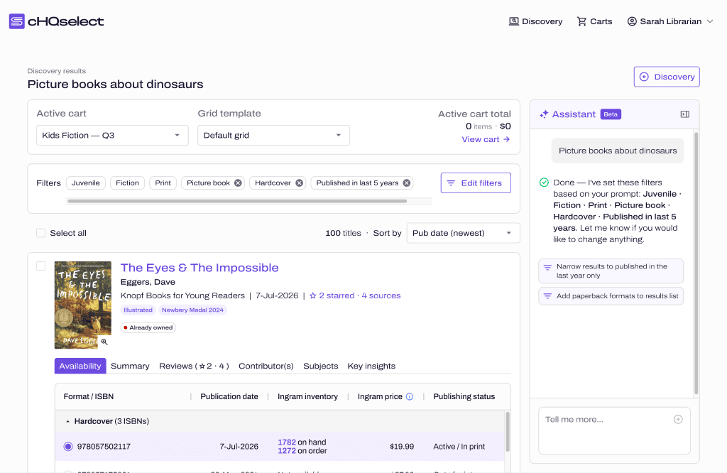
Every screen in the product is put together from the library.
The cHQselect design file
Context
A new product sitting on the old product's components
cHQselect replaced a product called ESP. To get a beta in front of customers quickly, we built it out of ESP's own components and only fixed the usability problems that were too obvious to leave. That was the right call for a beta, but it couldn't be what we launched with.
By that point I'd done the brand, so we had a name, a logo and a palette that looked nothing like the rest of library software. What we didn't have was anything to build screens out of.
Decision 01 of 02
I rebuilt every component from scratch
The bind
ESP's components were dated and inaccessible, and they were missing components we needed. We could've patched them one at a time as we went, but we'd have been carrying the old product's problems into the new one.
What I chose
So I rebuilt all of them from scratch, using Material Design as the base, and that meant I could build accessibility in from the first component.
What it was based on
ESP's own component set, which the beta had been built from.
What it cost
Nothing carried over. Every component had to be designed again, with all of its states, before a single screen could use it.
Colour and type
Two layers of colour, so nobody picks a hex code
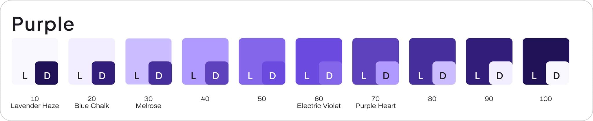
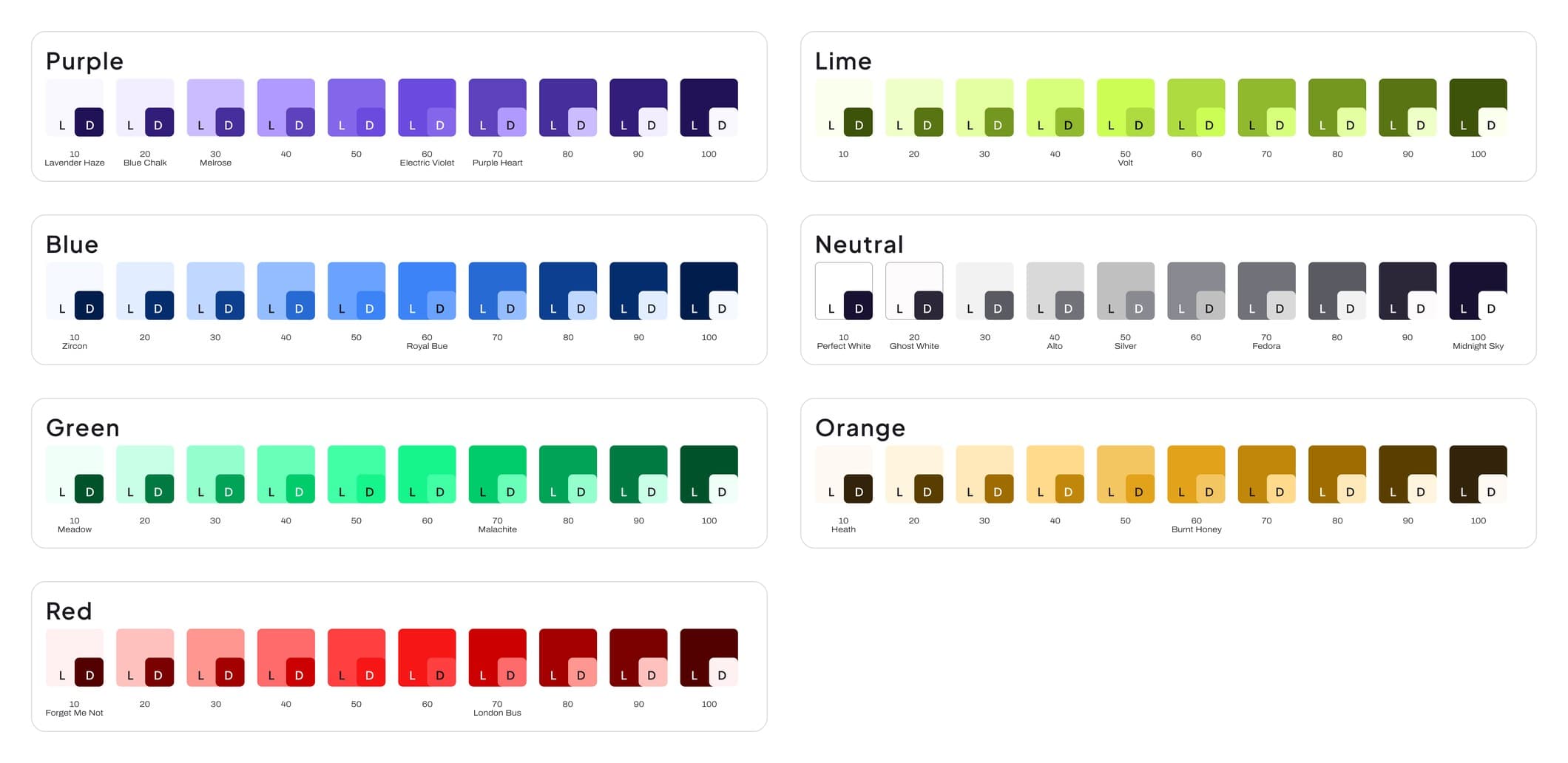
The colour works in two layers. Underneath there are seven ramps of ten steps each: purple, lime, blue, neutral, green, orange and red. The brand colours are just named steps on those ramps, so Electric Violet is purple 60 and Purple Heart is purple 70.
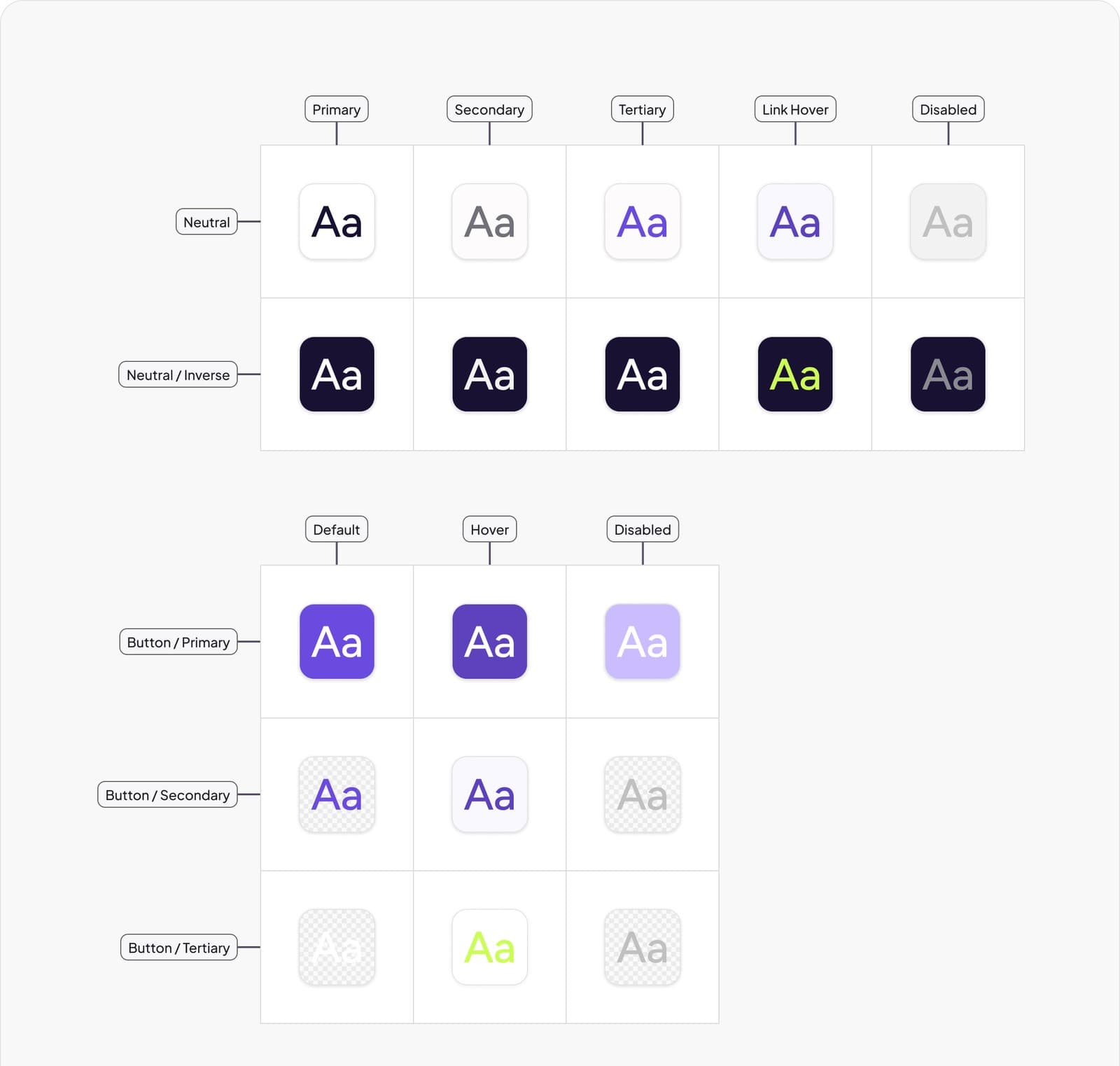
On top of that there's a usage layer, and that's the only layer anyone designs with. Every token is named by what it's for, then where it goes, then its state, so you get Fill / Button / Primary / Hover or Text / Neutral Inverse / Disabled. There are four roles, which are fill, text, icon and border. The type is one family, Archivo SemiExpanded, in five headings, three body sizes and a caption.
Components
Forty components, and every state drawn
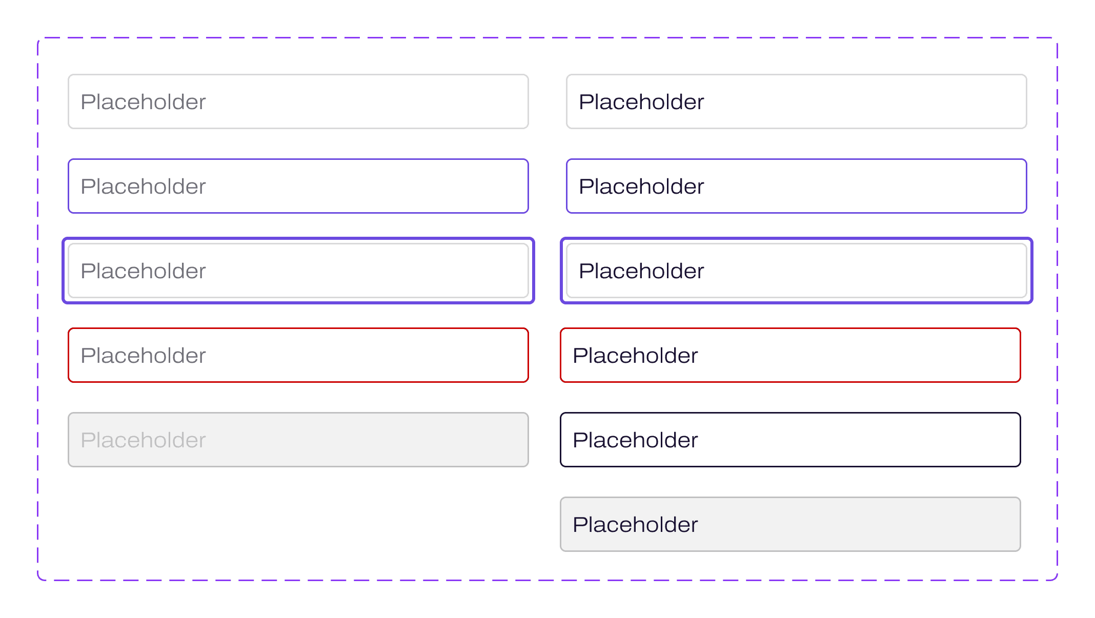
There are 40 components with 203 variants between them, and 94 icons. The reason the variant count is high is that I drew every state and didn't leave any for a developer to guess. A text field has default, hover, focused, error, completed and disabled, and each of those comes filled and not filled. The button has five types across five states.
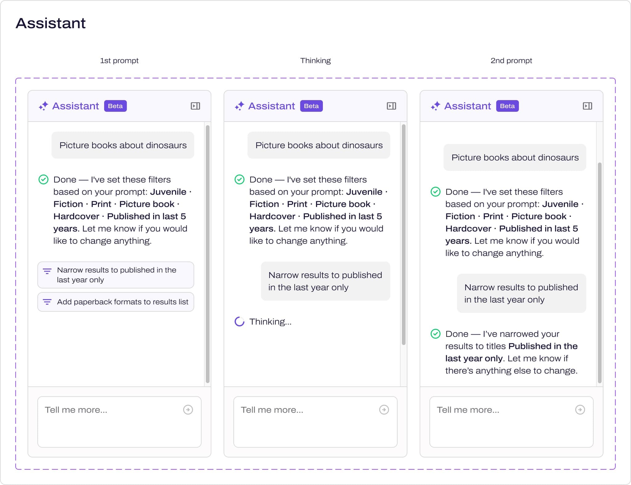
It isn't only a generic kit, though. The parts of cHQselect that make it cHQselect are components as well, so the AI assistant, the discovery search bar, the review popup and add to cart all live in the same library as the buttons.
Accessibility
Accessibility went in with the first component
ESP's components weren't accessible, and that was one of the reasons we started again. I lead WCAG 2.2 across our products anyway, so I built it into the components and didn't leave it for an audit at the end.
Every interactive component has its own focus state, and you can see them in the button set at the top of this page. White text on the primary button is 5.7:1 against Electric Violet, and 7.1:1 on hover. The messages set their words in neutral text and keep the colour for the icon and the border, so you never have to tell green from red to know what's happened.

Hand-off
How it gets to the developers
The system lives in Figma, and there isn't a coded component library sitting beside it. So the hand-off has to do a lot of the work. Developers get the designs in Dev Mode with annotations and a PRD, and they'll often get a clickable prototype that I've built with AI as well.
When it came to the tokens, our developer used Claude to capture them straight out of the file. Seda designs from the same library I do.
Decision 02 of 02
We launched without documentation, and it's still not written
The bind
We had a launch date at PLA 2026 and a whole product to design. Writing up how the system works was the one job that could wait without anything breaking on the day.
What I chose
So we launched without it, and told ourselves we'd come back to it.
What it cost
We've said "we'll come back to that" again and again, and we haven't had the time to yet. So the system still has no documentation.
What's next
What's next
The documentation is next, and it annoys me that it isn't done. What I've learned from this is to document early, because it never gets easier to find the time later on.
Where AI sat
What I used it for, and what I didn’t trust it with
Our developer used Claude to capture the tokens straight out of the Figma file, so nobody had to retype a hex code. A lot of my hand-offs also come with a clickable prototype that I've built with AI, so the developers can see how a screen should behave as well as how it should look.