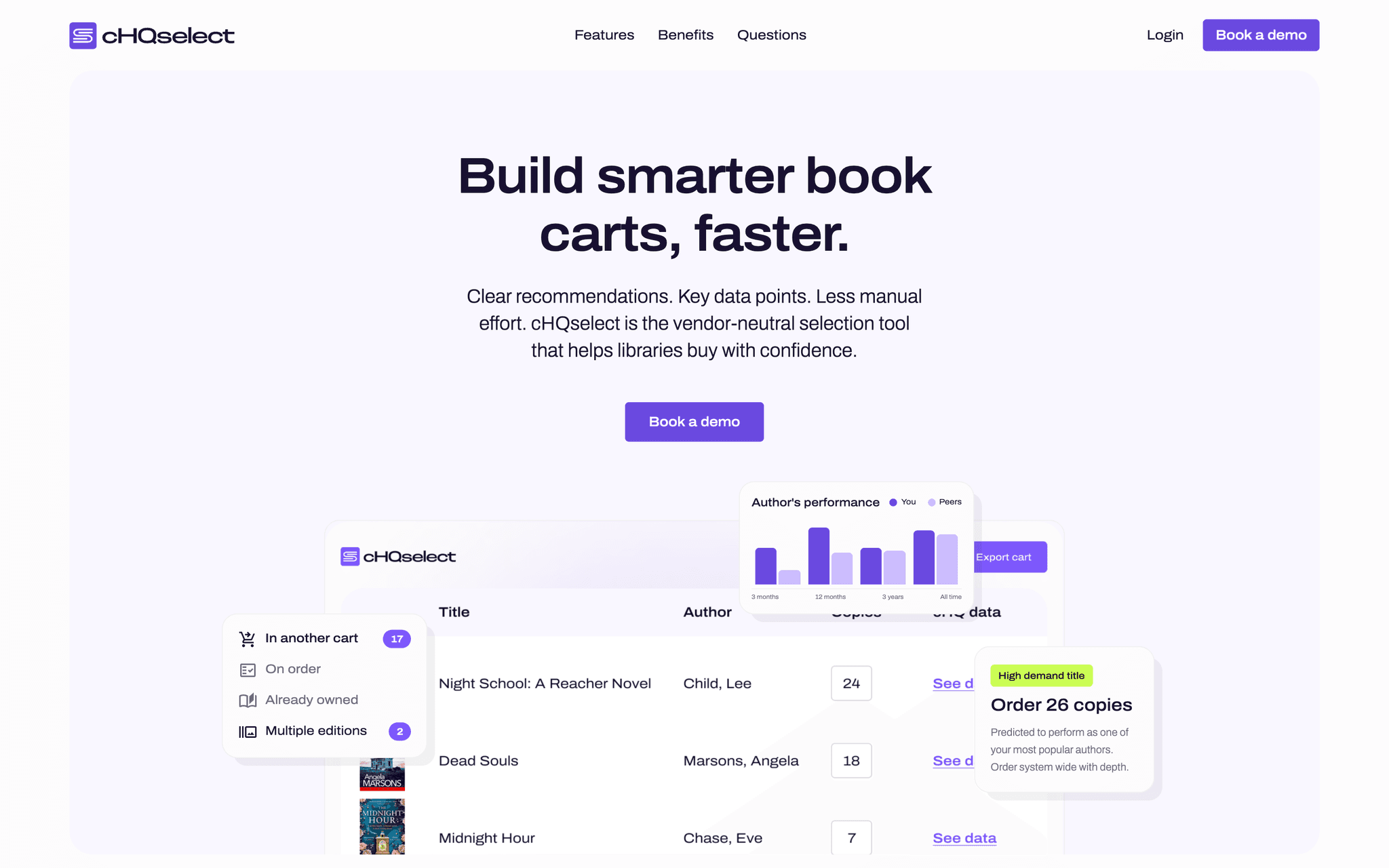
collectionHQ cHQselect
The replacement I designed kept 74% of the revenue we were losing
Our parent company collapsed and took the data with it. I replaced a product that its own users had never actually touched.
- Role
- Senior UX Designer
- Timeline
- October 2025 to now
- What I owned
- Research and validation, Brand, Design system, Product design
- Status
- Shipped
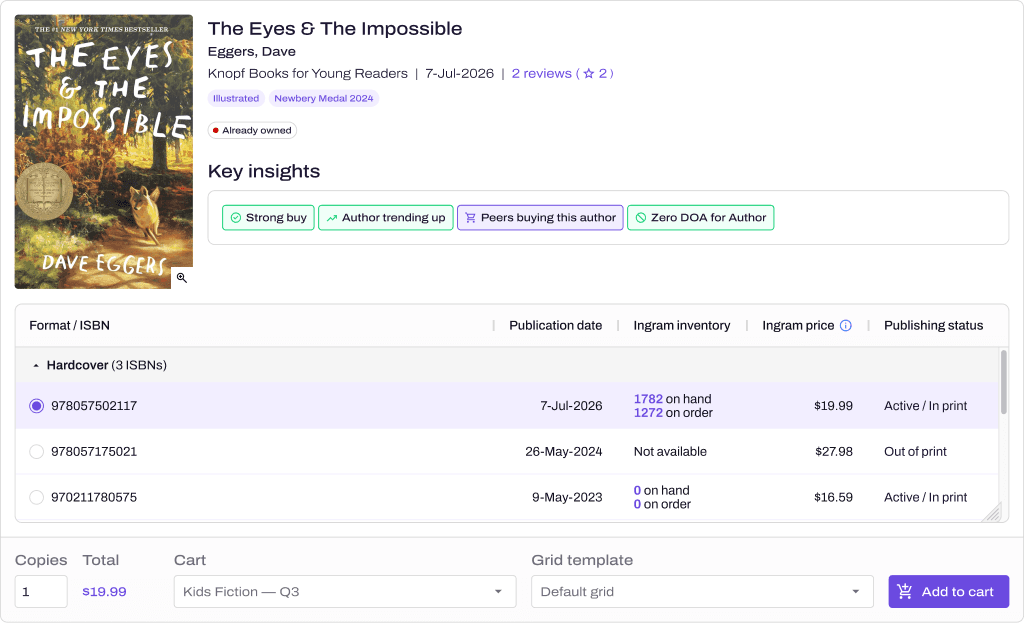
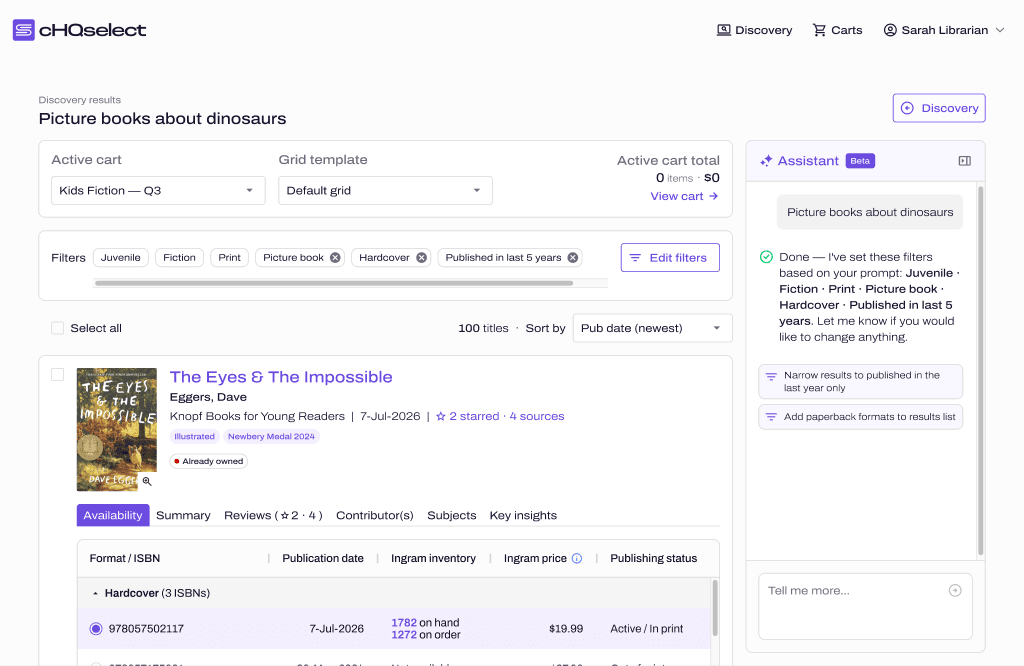 1Filters you can edit by hand2The AI sets the filters, and that's all3Stock and price on every title
- 1Filters you can edit by hand
- 2The AI sets the filters, and that's all
- 3Stock and price on every title
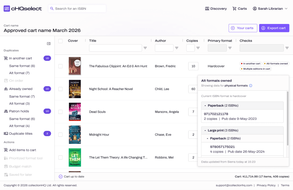
All the AI really gives you is a set of filters, and the librarian can edit them or throw them away. The assistant has since moved over to the right of the results, and they work fine without it.
The problem
Baker & Taylor owned the data behind our best-selling module. When they went into liquidation we couldn't keep running it, and every subscriber was heading for the exit.
- My role
- I designed the study and made sense of what came back, then I designed the brand, the design system and every screen of the product.
- The team
- A colleague ran the calls for the first study, and the wider team joined in on the design workshops.
The result
How this was measured
26% of subscribers cancelled at renewal. Without something to move them on to, we would've lost all of them.
Renewals, counted at contract, 2026
How this was measured
Just over £2m of that came in during launch week at PLA 2026.
Sales pipeline, not self-reported, From launch, March 2026
How this was measured
We did the first interview in October 2025, and the beta was in customers' hands in January.
October 2025 to January 2026
Context
A product that couldn't outlive its supplier
ESP was collectionHQ's selection module, the thing that told librarians what to buy. We were losing it because the data that fed it was owned by our parent company, Baker & Taylor.
Baker & Taylor went into liquidation. As a result the data stopped, the platform ESP lived inside went with it, and every subscriber was heading for the exit. We couldn't just wait it out, because renewals were coming up and there were only two honest things we could offer a customer. We could give them a refund, or we could give them something else to buy.
The users
Librarians had never used the product I was replacing
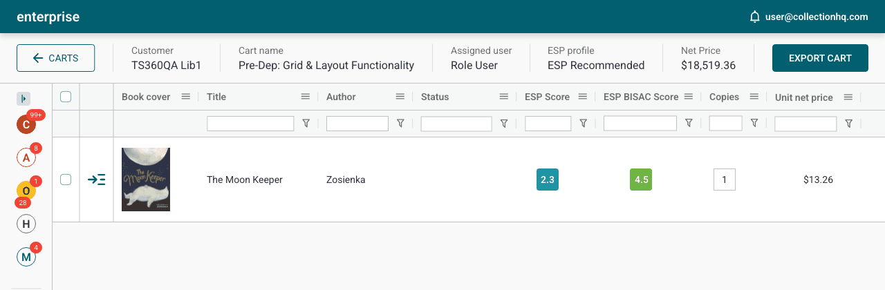
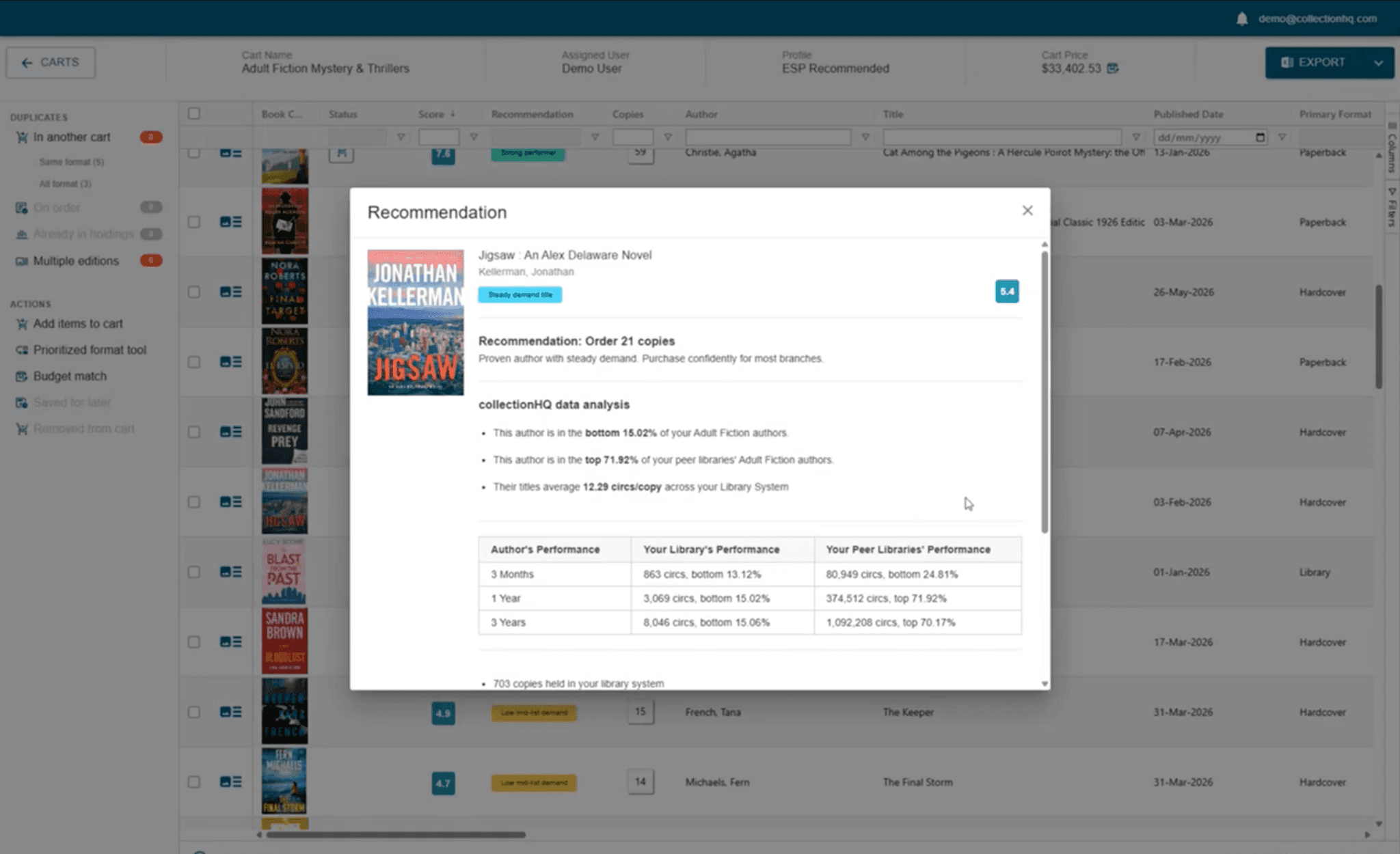
ESP was sold as a subscription service, and Baker & Taylor staff ran it on the customer's behalf. So the interface behind it was made for their own trained super-users and nobody else. It was over a decade old and pretty slap dash, and it had never needed to be easy because the people in it were in it every day.
That meant this was never going to be a rebuild. The librarians who'd now be sitting in front of it had never seen it before. So whatever I made had to do a specialist's job in the hands of someone doing it for the first time.
Research
Eleven libraries, and what they'd really lost
I designed the study, picked and recruited the participants, and made sense of what came back. I was away for part of the fieldwork, so I coached a colleague to run the calls. I sat in on the early sessions so I could tell him what he'd done well and what to do better next time. I moderated the second study myself.
We spoke to eleven US public library systems: Boston, Frisco, Gail Borden, Hinsdale, New Orleans, New York, Phoenix, Saint Charles, San Francisco, San Jose and Scottsdale. Every conversation ran for an hour or longer, and what they described was a workflow that had quietly fallen apart.
What the research found
- To find new titles, selectors were hopping between vendor lists, review journals and publisher announcements, and nothing showed them the whole picture.
- The biggest time sink was splitting copies across branches by hand. The biggest systems have twenty-five branches or more, and if the list changed they had to start again.
- Once they were building carts with several vendors at the same time, duplicate orders got far more likely.
- Staying vendor-neutral had stopped being a preference and become a strategy, because nobody wanted all their eggs in one basket again.
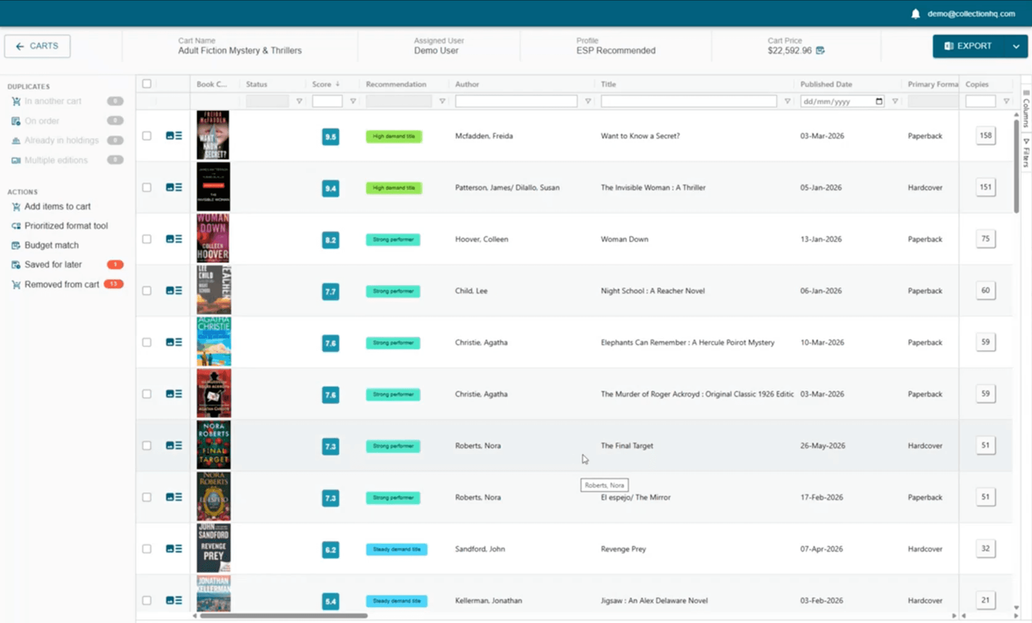
- ESP's scores never showed their working, so selectors would go hunting through other systems to check them. That's the finding that shaped the product.
Decision 01 of 04
Ship it rough and ready, and ship it now
The bind
Renewals were coming up and there was nothing for customers to renew onto. A polished prototype would've cost weeks I didn't have, and what the business really needed to know was whether librarians would buy the idea at all.
What I chose
I built the beta out of ESP's own components and only fixed the usability problems that were too obvious to leave. That meant the commercial team could give customers two options: cancel now and get a prorated refund, or stay on contract, get the beta straight away and decide at renewal. That approach worked, and enough customers stayed that we kept 74% of the revenue. Without it, we would've lost 100%.
What it cost
It meant customers saw a rough product at the exact moment they were deciding whether we were still a safe bet.
This is the first thing that's made me feel hopeful in 12 months about book ordering. It actually feels like it could be an improvement on what we had before.
New York Public Library, on the beta
Decision 02 of 04
A new name, to break with a failed parent
The bind
The rough and ready beta had done its job and kept customers with us, but we didn't want to take something that looked like ESP to market. Baker & Taylor had failed publicly, and the market was trying to work out whether collectionHQ was a safe bet or the next domino to fall.
What I chose
I gave the product a new name and a new identity, so nothing about it linked back to Baker & Taylor. That was a commercial decision more than a design one, and it cut the tie right when the tie was costing us the most. The interface had to change for a different reason. A decade-old tool built for trained operators was never going to work for librarians using it themselves, and a restyle wouldn't have fixed that.
What it cost
We gave up whatever recognition ESP still had with the very subscribers we most needed to keep.
The brand
The identity had a job to do
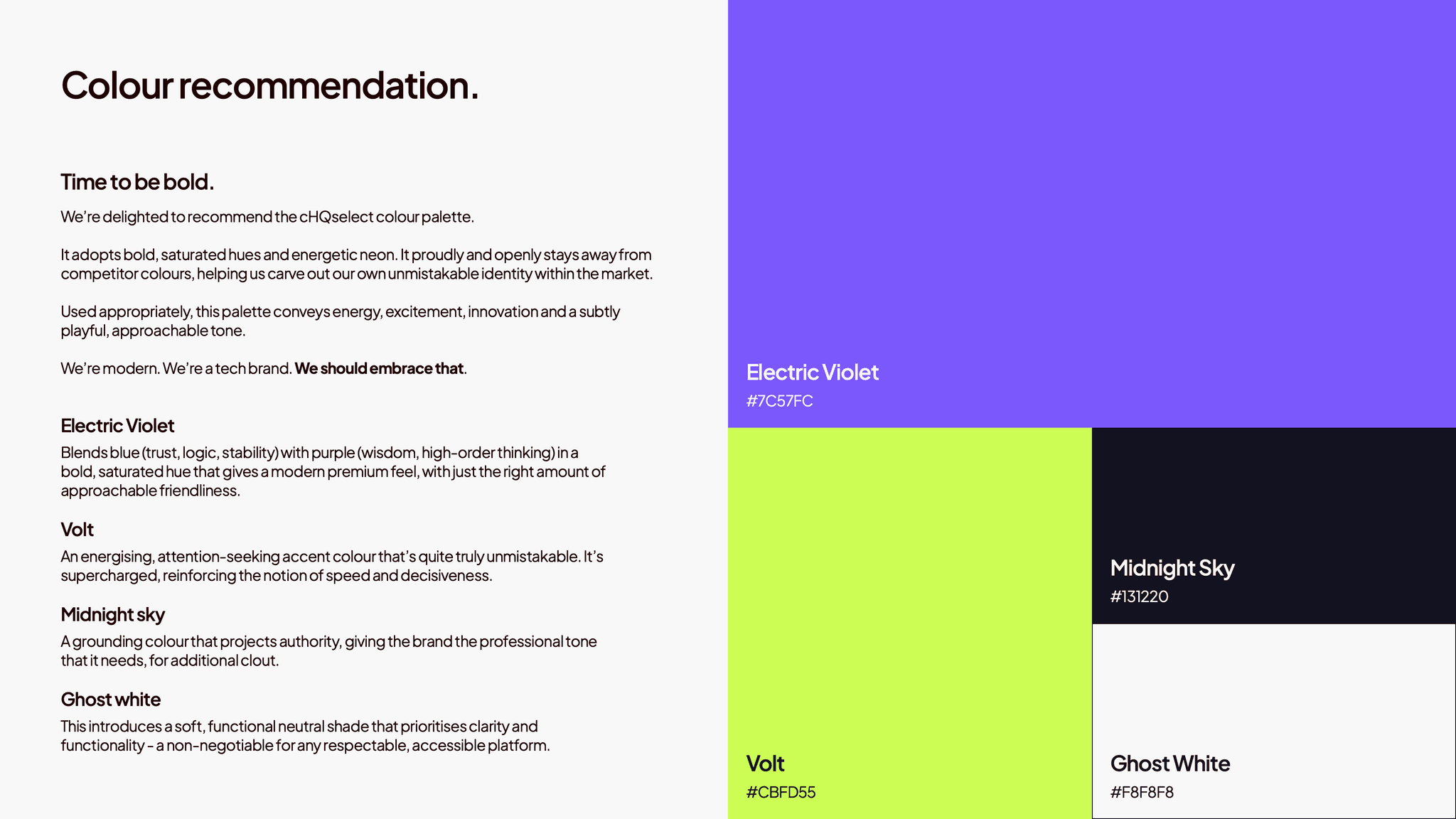
Library software had settled on a look. It was all blues, greens and the occasional red, and very little of it looked like it had been built this decade. Nobody was going to mistake a new entrant for a safe pair of hands anyway, so I stopped trying to look like one.
The one colour I couldn't use was our own. cHQacademic is our sister product and it already owns teal, so sharing it would've made cHQselect look like a variant of something else right when it most needed to look new. I wrote that down as a rule: no teal, no orange, no circles. That ruled out collectionHQ's own visual language as well as everyone else's.
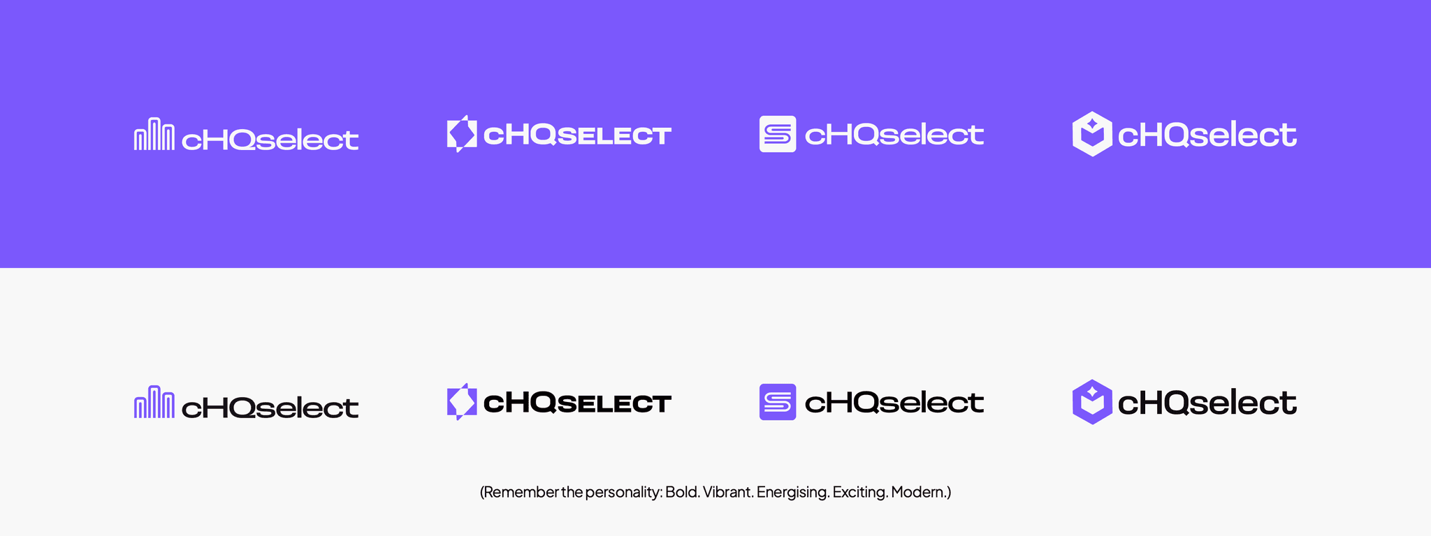
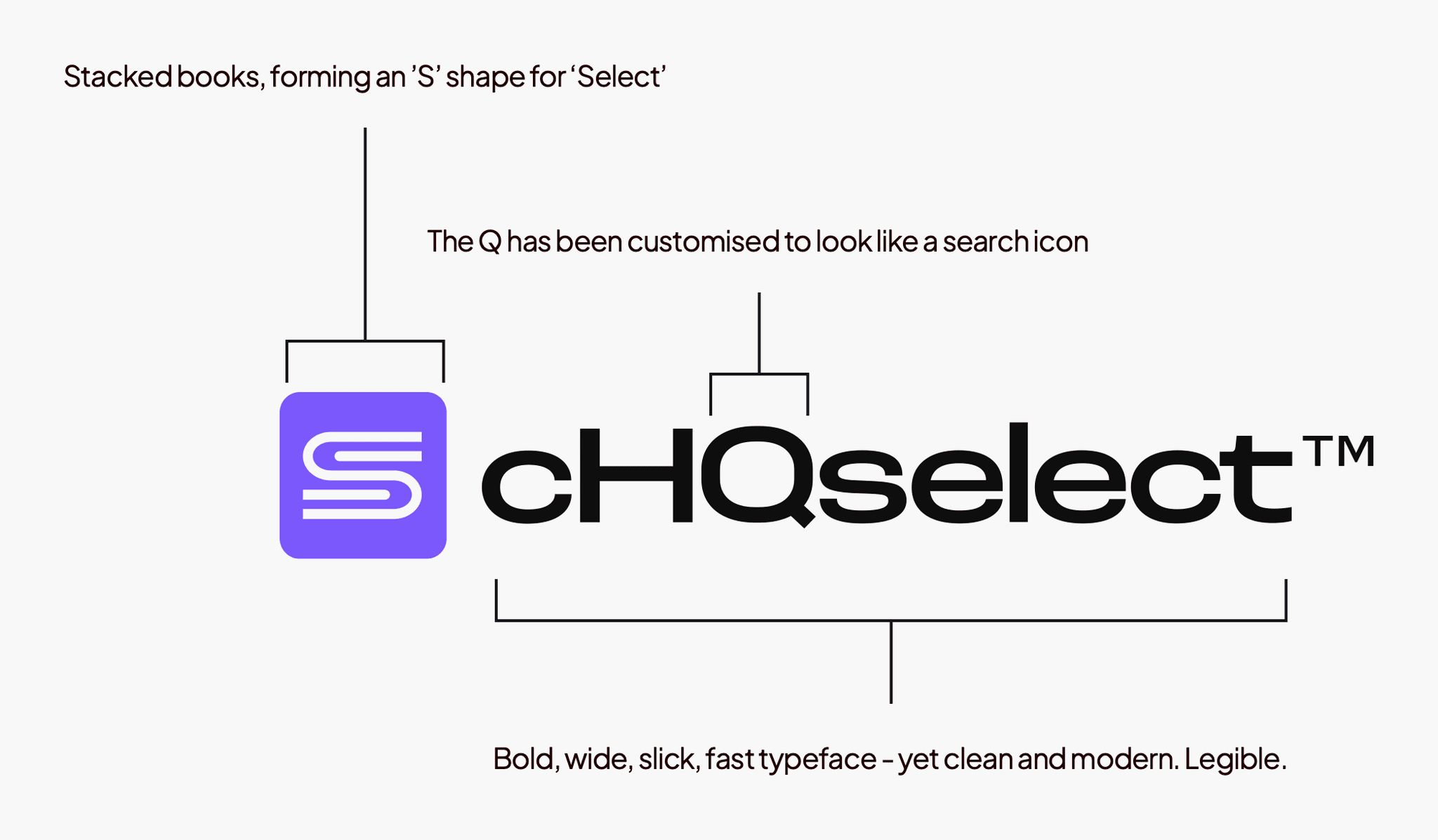
I wrote the positioning and the voice as well as doing the visuals. Then I took four logo routes to the director team, gave them my reasoning for each one, and told them the decision was theirs. They went with the stacked books, and I built the design system out from there.
Launch
We launched at PLA 2026
We launched cHQselect at PLA 2026 in Minneapolis, which is the US public library conference. I designed and wrote the launch page as a sales tool more than a brochure, so the team could book demos straight off the stand. What happened next was we generated just over £2m in sales pipeline that week.
Discovery
Then we built discovery
At launch, the only way to get titles into a cart was to upload a list of ISBNs. Librarians told us plainly that if they couldn't search for titles, and see the data they'd need to judge what to buy, they wouldn't use cHQselect for selection at all. So discovery was the next big piece of work, and it lets them search right inside the tool.
I ran ideation workshops with the wider team to get the concepts out, and then I built a clickable prototype of the whole journey. It had four screens. There was a search screen with two ways in, an AI prompt and a manual search. There was an AI screen that asked follow-up questions to narrow things down. Then there were the results, and a single title view.
Then I put the prototype in front of ten librarians from seven libraries across the UK and the US, all of them cHQselect customers. I ran every session myself, about thirty minutes each, and I told them to be as brutal as they liked.
What testing told us
- A narrow majority were sceptical of the AI, or outright critical. Nearly all of them said they'd rather use manual search and experiment with the AI on the side.
- Manual search was too easy to miss. One person never found it at all.
- No two libraries search non-fiction the same way. Some use BISAC headings, some use Dewey, and one just types in keywords.
- Reviews went down a treat, because Ingram only gives them abridged reviews and charges extra for the full ones.
- The AI assistant down the left of the results didn't make an impression either way. People mostly ignored it.
- Most of them said they'd release it as it was, with a few tweaks. Cardiff said they'd "100% use it".
Decision 03 of 04
I argued for manual search first, and I was overruled
The bind
Discovery was the module that made cHQselect worth subscribing to, and AI-assisted search was the bet the business had already made on it. Then testing came back, and a narrow majority of the librarians were sceptical of the AI. Several of them were openly critical.
What I chose
Almost all of them said they'd try the AI as long as manual search was there as the reliable path. So I made the case for leading with manual search and offering the AI alongside it, and I was overruled. The business was under pressure to ship AI-first, so the AI prompt stayed as the front door. What I could do was give manual search a lot more visual prominence, so nobody could miss it again. That's what shipped.
What it cost
The screen still leads with the thing most of the librarians I tested with trusted least. Manual search is a click away instead of being the way in. And the AI assistant I'd put down the left of the screen made no impression on anyone, either way.
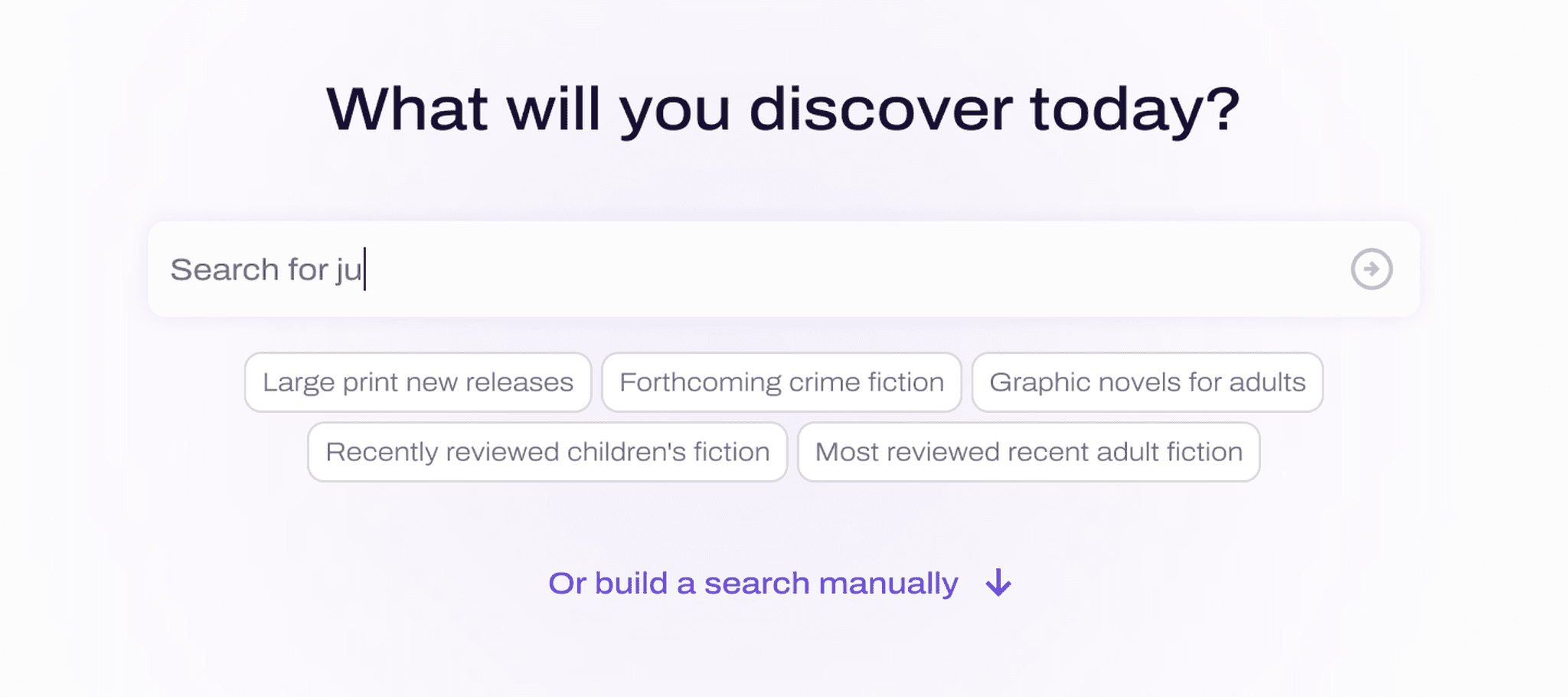
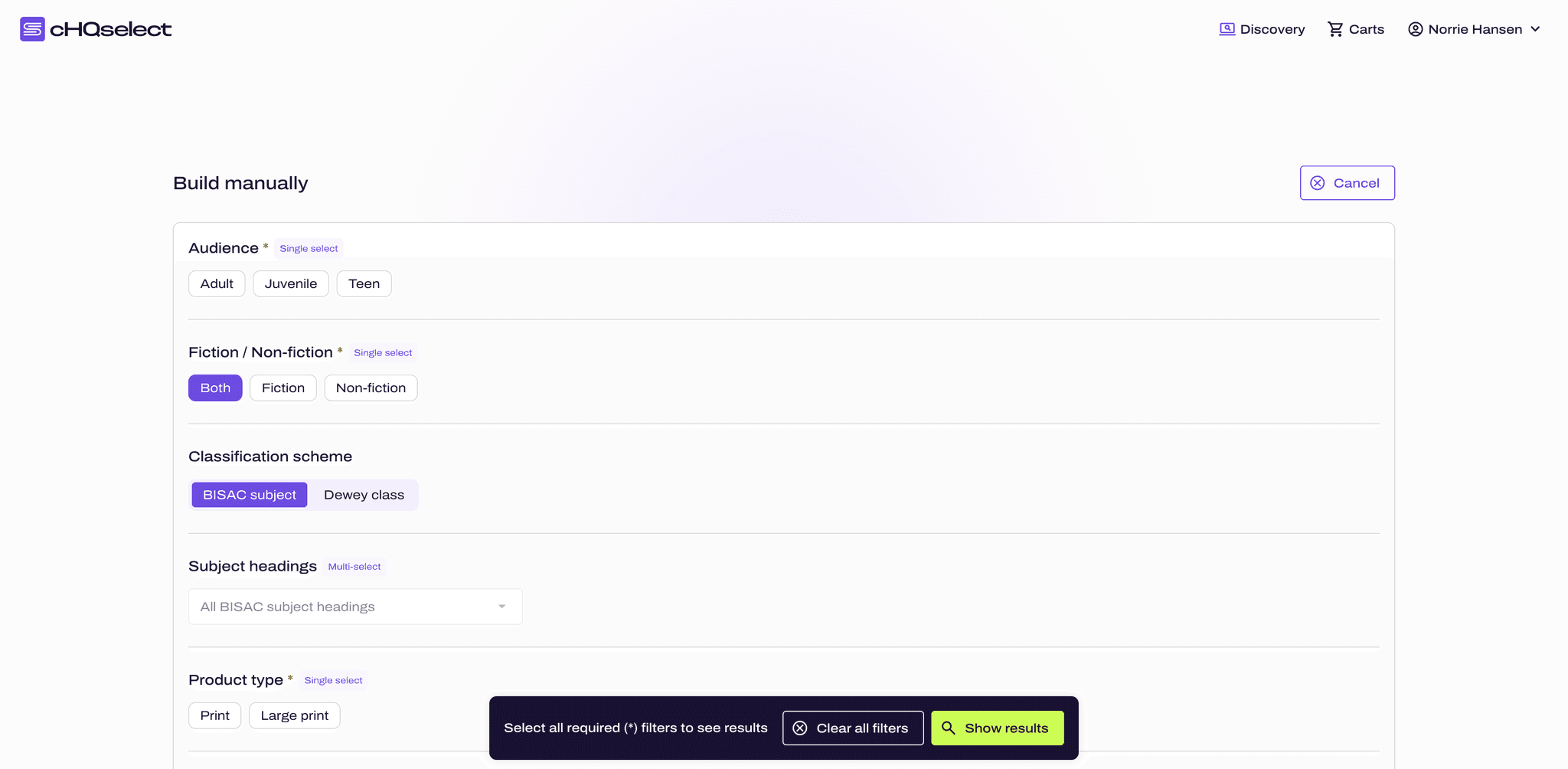
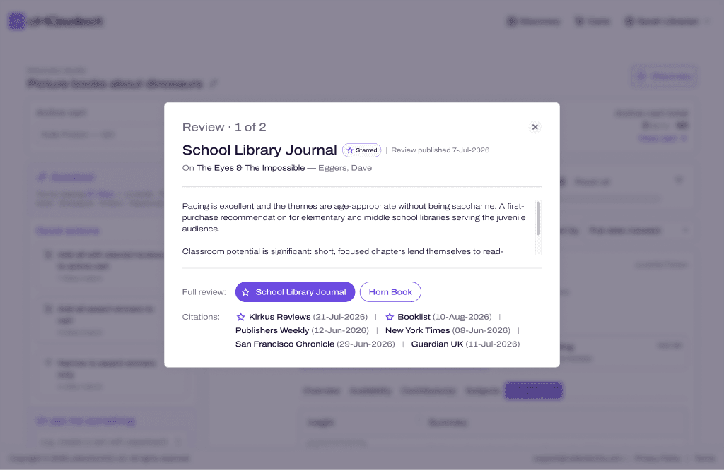
I think it is ready. The reason it is, is because you can build manually if you don't want to talk to the AI.
New York Public Library, on discovery
Decision 04 of 04
I deleted a screen I'd already designed
The bind
The AI path had an extra step in it that I'd designed myself. It asked you a run of narrowing questions before it showed you any results. Everyone in testing understood it, but the list of things they wanted changed gave it away. They wanted to go back and change an answer, skip a question, or just see all the questions at once.
What I chose
When I looked at it again, it just felt like an AI wrapper around a manual search, because it was asking exactly what the manual path asked anyway. So I took it out completely instead of iterating on it. The other changes came straight out of the same sessions. I moved manual search up the page, because one participant never scrolled far enough to find it. I added a Dewey and BISAC toggle once it turned out that no two libraries search non-fiction the same way. And I rewrote a cart question that people had been reading as a threat to fill their carts for them.
What it cost
I threw away finished design work, weeks out from a launch date nobody could move.
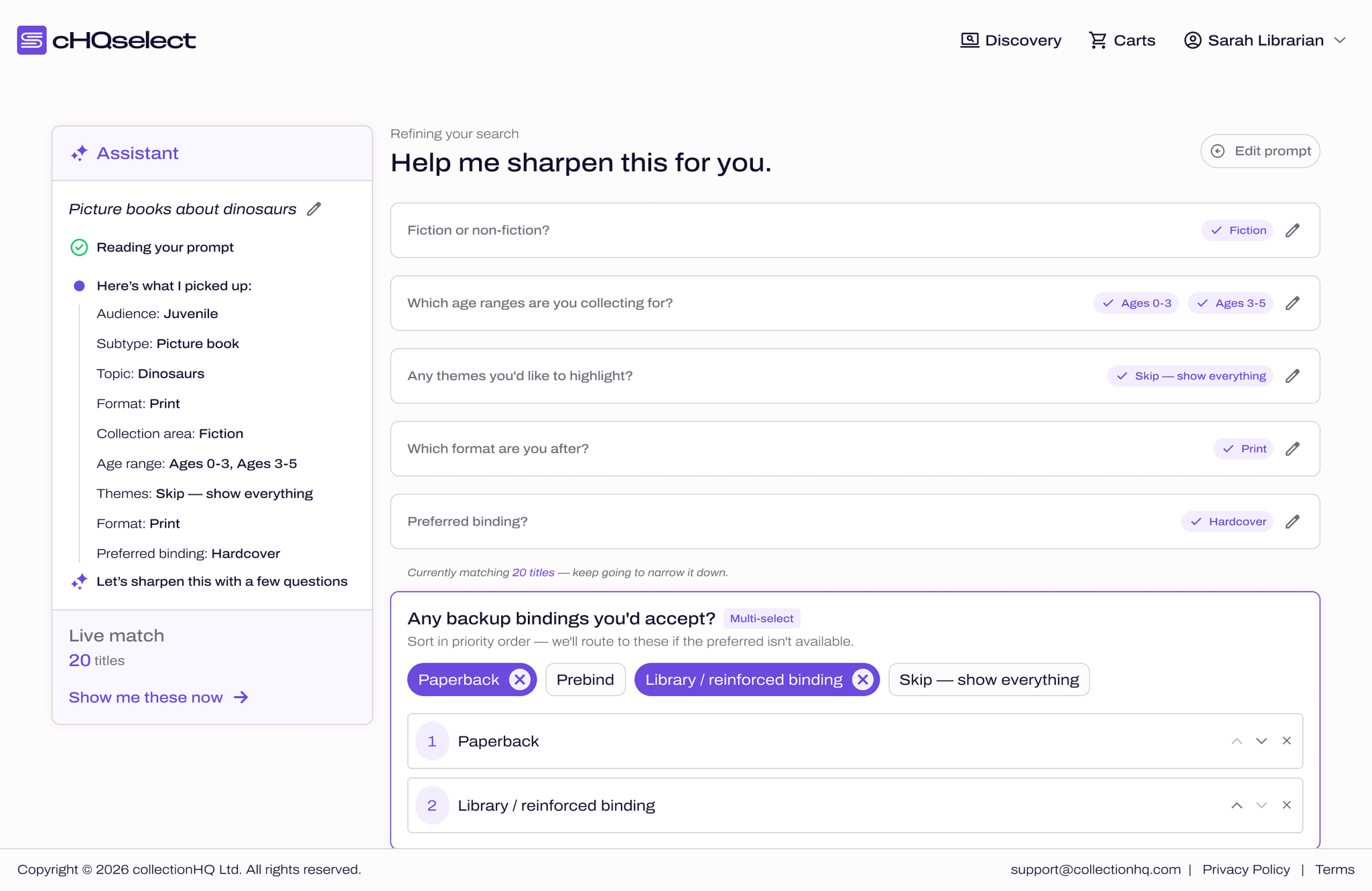
What didn't ship
What I couldn't ship
The research had validated a transparent title score. It answered the problem selectors kept describing, which is that if a number hides its workings, people just go and check it somewhere else.
I couldn't build it in time. There were far too many technical constraints, and if we'd persevered it would've delayed a launch the business couldn't afford to delay. So a few weeks after launch we shipped Key Insights instead, which gives you little bits of information about an author, a subject or a title in a clean, digestible way. It isn't as good as a score, and I'm not going to pretend it is. But it gave people part of what the research had validated on the date that mattered, and we're actively working on scoring now.
I'd make the same trade again, because a smaller thing on the date the business needed it was worth more than the right thing late.
See it live
Open it yourself