collectionHQ Prioritise Items
I turned a 7,000 item report into the hundred that mattered
collectionHQ could hand a librarian 7,000 titles when they only had an hour. I designed a wizard that asks how many they want.
- Role
- Senior UX Designer
- Timeline
- Nine weeks, shipped November 2024
- What I owned
- Research, Facilitation, Product design, Usability testing
- Status
- Shipped
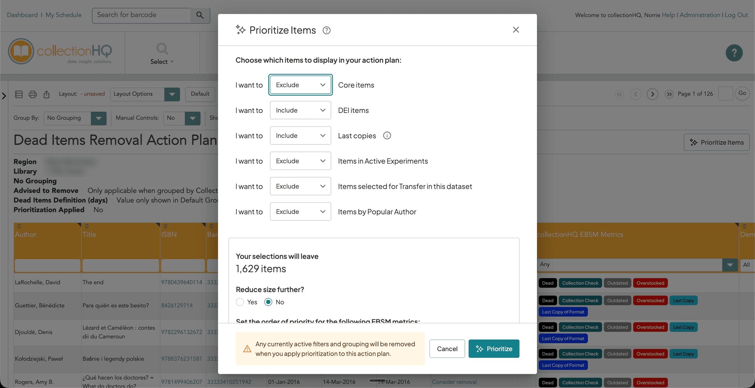 1Six things you can include or leave out2A live count of what's left3It all sits inside the decade-old report
- 1Six things you can include or leave out
- 2A live count of what's left
- 3It all sits inside the decade-old report
The problem
One collectionHQ report could come back with 7,000 titles, and the librarians opening it had thirty to sixty minutes between desk shifts. That's completely overwhelming.
- My role
- I ran the research and the ideation workshop, designed the wizard, and moderated both rounds of testing.
- The team
- I wasn't the product owner. He had the final say, and I worked alongside him, a business analyst and the development team.
The result
How this was measured
That's the biggest list collectionHQ could hand a librarian in a single report.
Product data, quoted in the research brief, 2024
How this was measured
That's the range people gave me when I asked how many items they get through. A lot of them didn't have a number at all, and just worked through a list over weeks.
Ten librarians, nine libraries, UK and US, March 2024
How this was measured
There were ten in the research study and nine in usability testing, and I moderated both.
Condens reports, March and June 2024
Context
The tool was powerful, and that was the problem
collectionHQ analyses a library's whole collection and tells staff what's stale, overstocked or underperforming. It's incredibly powerful, but it's huge, and a single report could come back with 7,000 titles.
The people opening that report have a spare thirty to sixty minutes a day, in between desk shifts, programmes and outreach. Some only get two hours a week. So when 7,000 titles come back, it's completely overwhelming, and you don't know where to start.
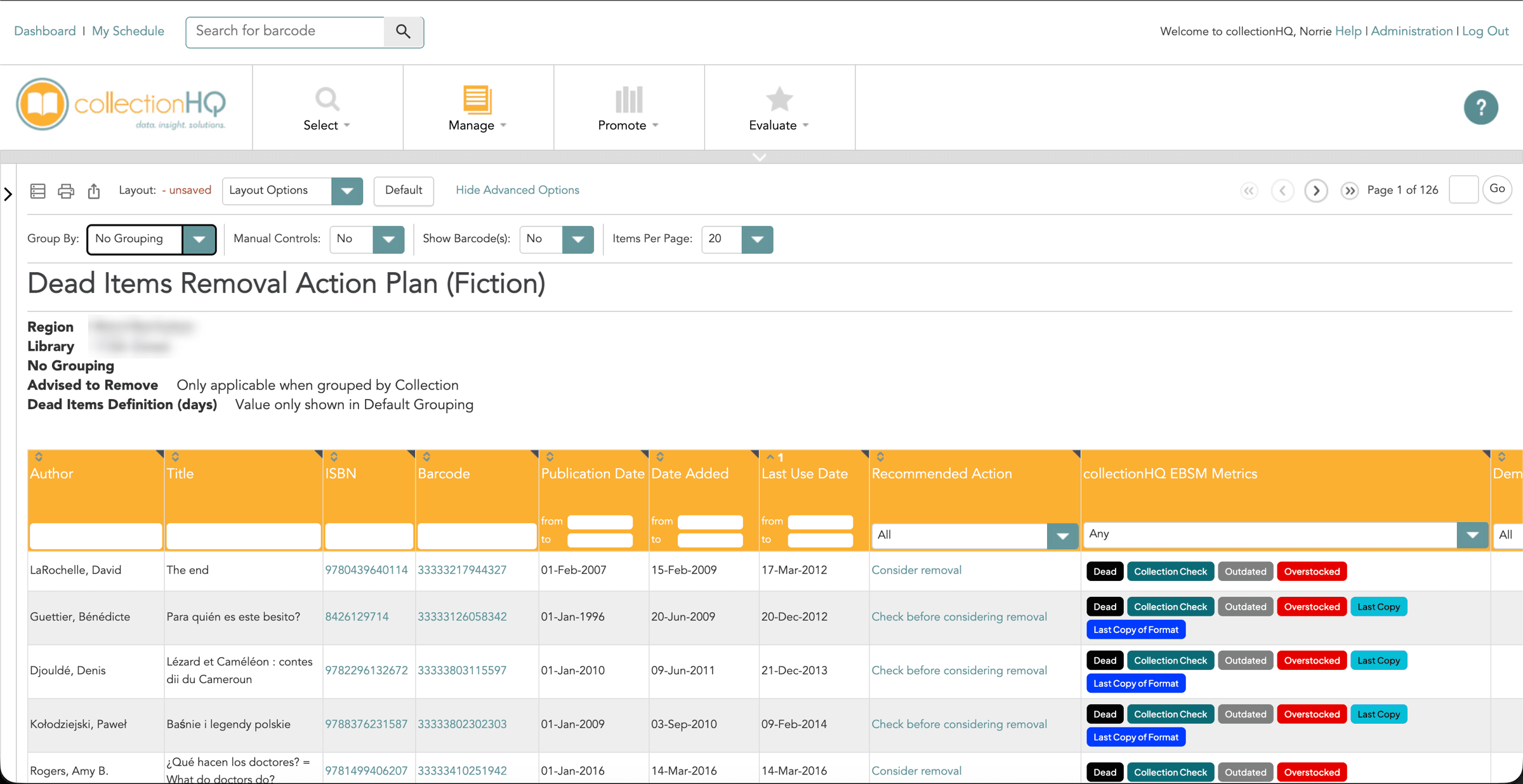
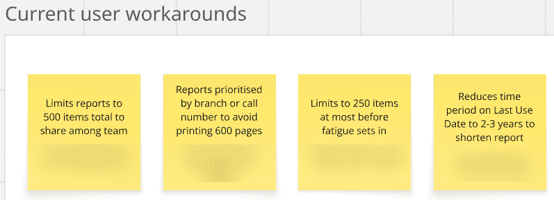
What librarians did instead was apply their sorts and filters, print the report or export it to a spreadsheet, and then cut the spreadsheet down by hand until it matched the time they had. All of that ate into the hour they were supposed to be spending at the shelves.
Decision 01 of 03
Let them ask for a number instead of a sort
The bind
The product already had sorting and filtering, and neither of them helped. They both answer "show me this kind of item", but neither one answers "give me as many as I can finish today", and that was the only question anybody actually had.
What I chose
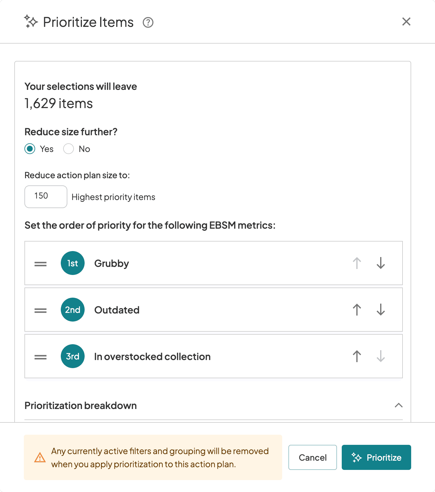
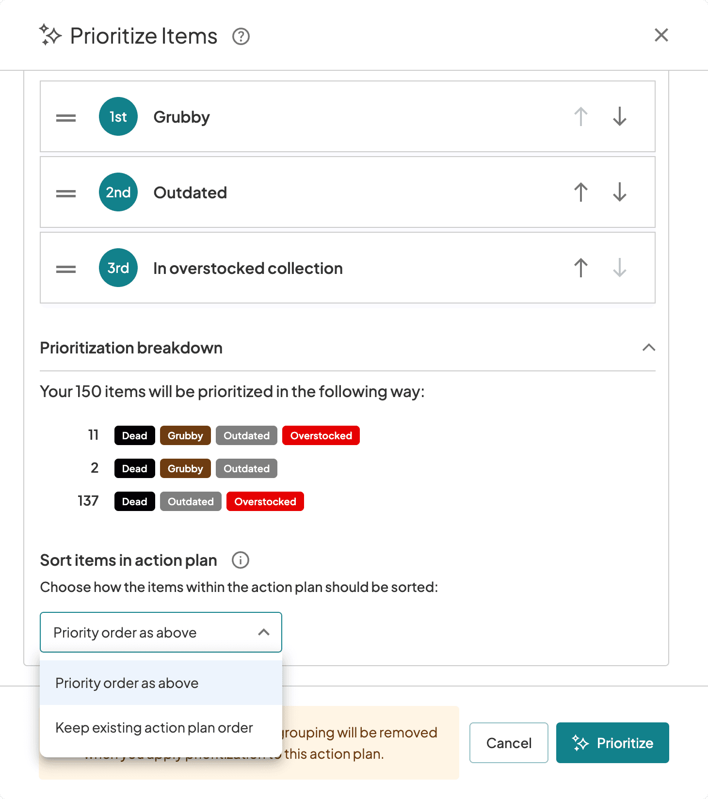
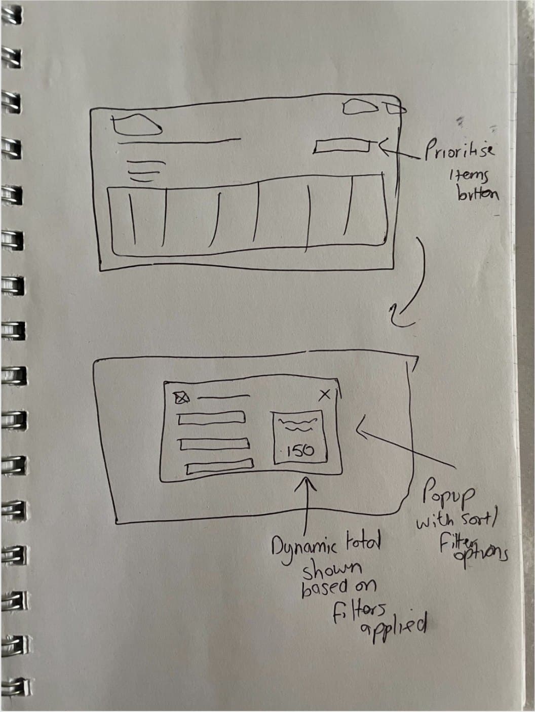
So I designed the wizard around prioritising instead of filtering. A librarian says what to leave out, ranks the metrics that matter to them and, crucially, types in the number of items they want. There's a live count that updates as they go, so they can see if they've cut too far before they commit.
What it was based on
In the first study, ten librarians described the same spreadsheet workaround without me prompting them.
What it cost
It only works if you know your number, and plenty of librarians don't have one. They just work through a list of any size over weeks, so for them this doesn't change anything.
Decision 02 of 03
I built it inside a decade-old interface, not around it
The bind
The collectionHQ interface was over ten years old. It looked dated, it failed colour contrast, and it was confusing if you didn't already know where everything was. Rebuilding the whole product around one new feature was never on the table.
What I chose
So I built the wizard to sit inside that interface and match it, and then I fixed accessibility within the feature itself. That meant contrast ratios, keyboard operation and ARIA labelling. Staying on brand with a dated product was the constraint, so I worked within it instead of fighting it.
What it cost
The feature itself is accessible, but the product it opens from still wasn't, and a wizard can't fix the page behind it.
Research
Where the design came from
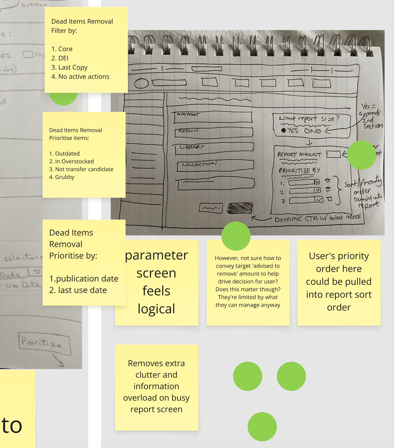
I ran a three part remote ideation workshop with Product, Engineering and Customer Support. We did quick-fire concepts, then sketching, then dot voting to choose, and the Product Director had the casting vote if there was a tie. The prioritisation wizard came out of that room, not out of my head.
Then I prototyped it and showed it to Engineering before I showed a single user. That meant we caught the build concerns while they were still cheap to deal with.
What the research told us
- The librarians who know their number gave me anything from 15 to 200 items per session. A lot of them don't have a number, and just work through a list over weeks or months.
- They already prioritise by last use date and oldest publication date. Whether a book's a bit battered or tatty matters less, except for children's books.
- Most of them exclude DEI items, and most keep last copies. A few exclude series, and there wasn't any way to do that in collectionHQ at all.
- If you prioritise a dead items report by condition, you get a combined weeding list. Several of them said that's something they'd wanted for years.
- Most of them stop weeding over the summer, when circulation peaks and staff are on leave.
Decision 03 of 03
I let customers choose which of my features shipped first
The bind
The EBSM metrics column and this wizard were two halves of one project, and they were both mine. We didn't have the resource, so we couldn't do both at the same time. I could've just gone with my instinct.
What I chose
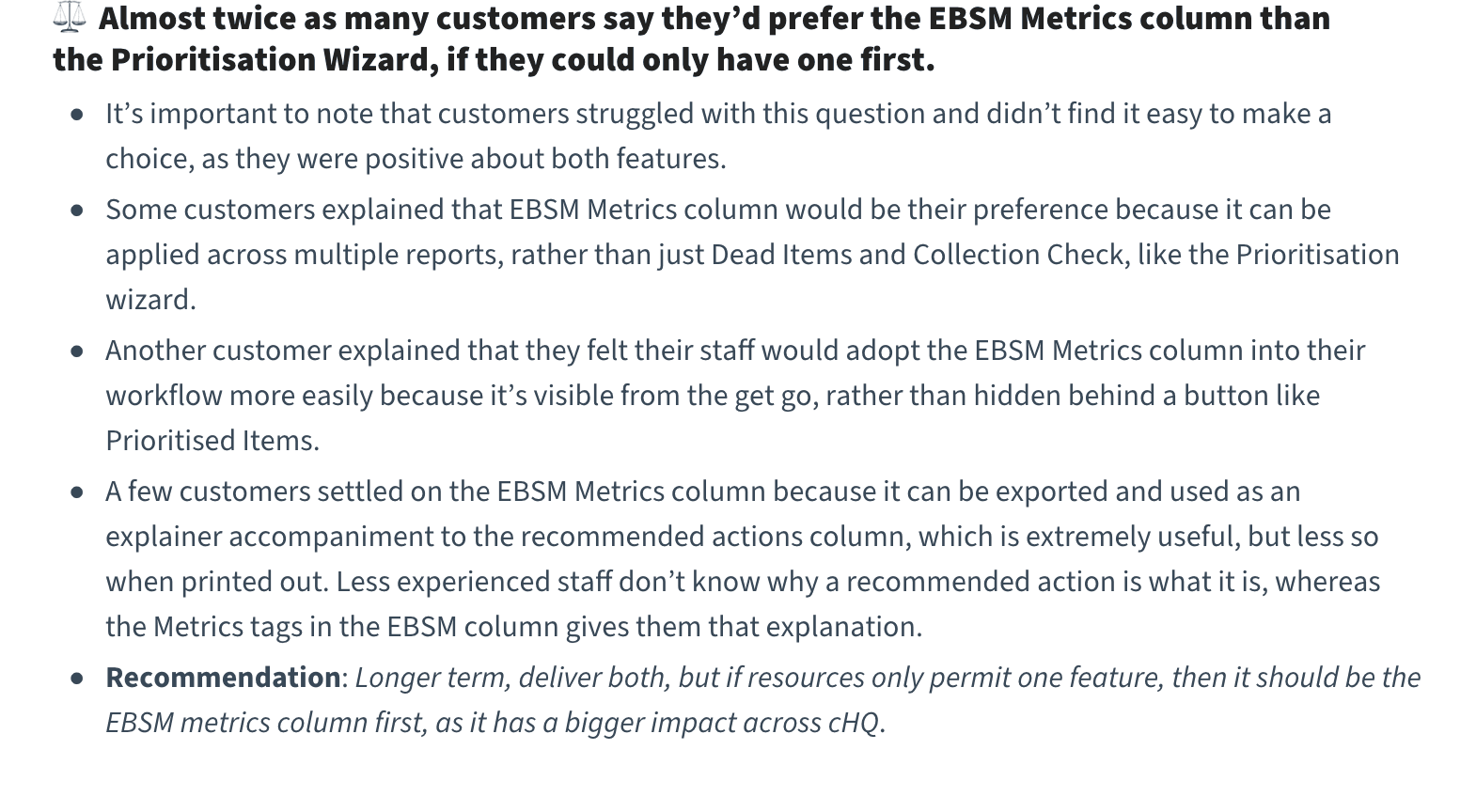
So I put the question to customers in the usability sessions instead. If you can only have one, which should come first? Almost twice as many chose the metrics column, because it applies to more reports, it's visible instead of hidden behind a button, and it explains why an action was recommended. So that's what we did, and the metrics column went first.
What it was based on
I asked nine librarians across eight libraries directly, in June 2024.
What it cost
That delayed Prioritise Items, the feature I'd been building towards, by about three months. I'd designed a question that could go against me, and it did.
If you could only have one first
Five of the eight libraries chose the metrics column
- 5 EBSM metrics column first
- 3 Prioritise Items first
| EBSM metrics column first | 5 of 8 |
|---|---|
| Prioritise Items first | 3 of 8 |
One block per library, counted from my June 2024 research report.
Testing
What testing changed
Every participant found the new button without being prompted, worked their way through the wizard, explained back what it was doing and applied the result. It passed, but it didn't come out of testing unchanged.
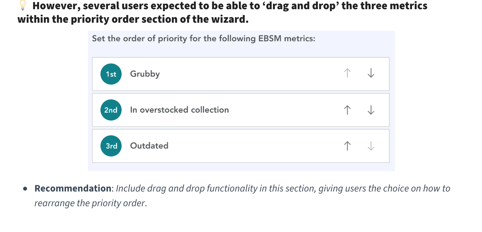
Several people tried to drag the metrics into order instead of using the up and down arrows, so drag and drop went in alongside them. The link for removing a prioritisation was too easy to miss, so it became a secondary button, and I added a second way to get to it from inside the wizard. And one report size across every branch turned out to be unusable, because branches differ in collection size and staffing, so administrators can now set sizes per branch.
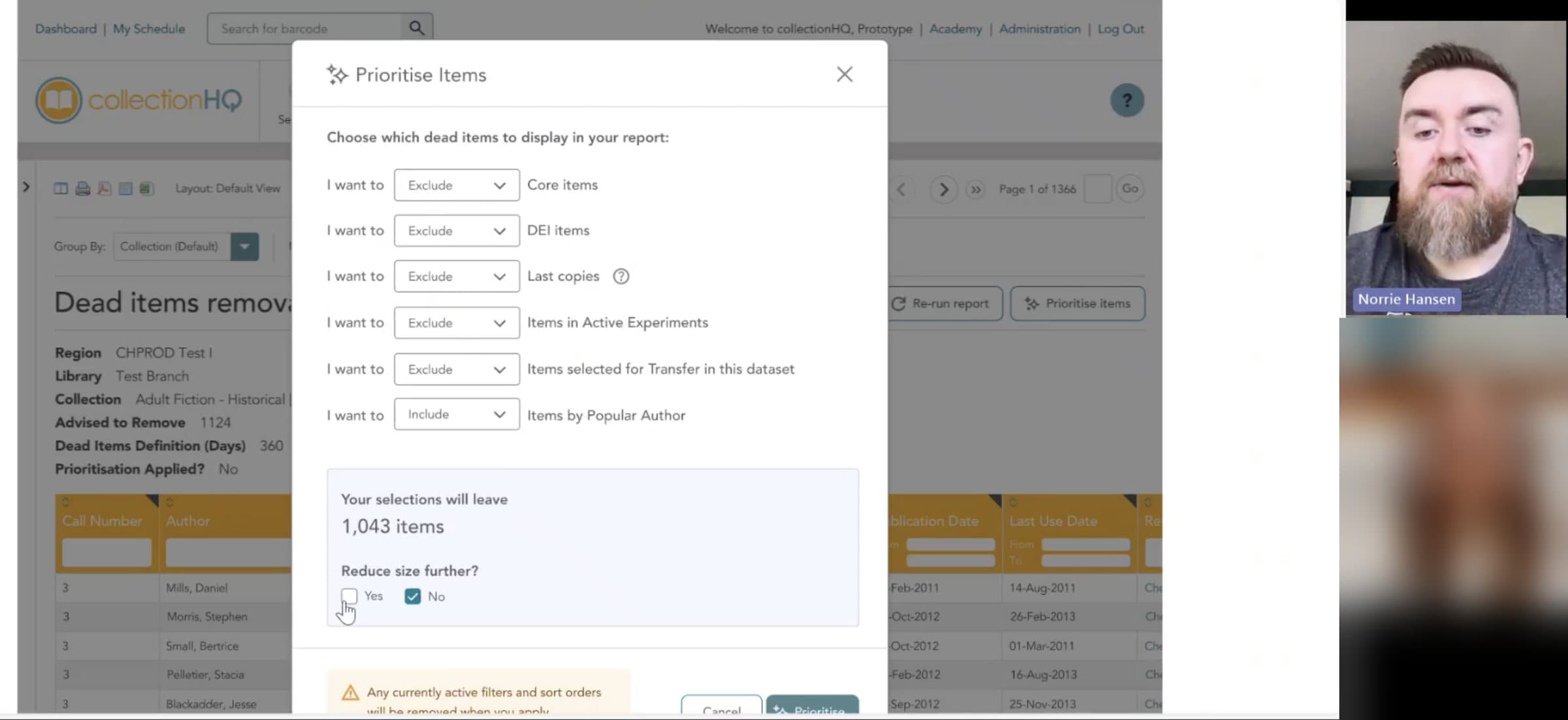
It calculates right at the bottom how many will leave in, because I can immediately see if I've limited it too far.
Usability participant, June 2024
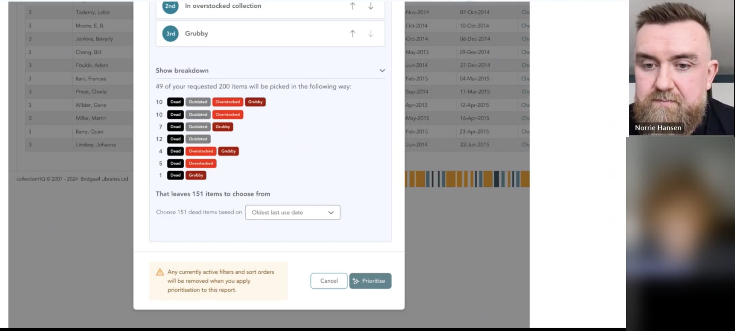
Please launch this. It'll save me so much time from having to print off 30 page reports and use a hi-lighter to mark the items I think are most important.
Ascension Parish Library, Louisiana
The outcome
The outcome, and why there's no number
This is a difficult one to quantify. Librarians had to weed before this shipped, and they still have to now. So it didn't move adoption, it didn't change usage numbers and it didn't close any support tickets, because none of those were ever the problem. I'm not going to dress that up.
What changed is that the preparation went away. Nobody has to export a report and trim it in a spreadsheet any more. I only really have anecdotal evidence for that, which is customers telling us it saves them a lot of time.